Aug 14, 2026
Last Updated: August 14, 2026
A well-designed drinks menu is a strategic tool that shapes customer behaviour, increases average transaction value, and reinforces your brand identity. At Swallow Drinks, we've worked with hospitality venues across the region for over 40 years, and we've seen firsthand how the right menu layout transforms profitability. The difference between a mediocre menu and an exceptional one comes down to thoughtful design: how you organize categories, where you position highest-margin items, and how visual hierarchy guides the customer's eye.
This guide covers five proven drink menu layout designs that work across different venue types. Whether you're running a traditional pub, a modern cocktail bar, or a gastropub, these designs offer practical frameworks you can adapt immediately.
Your menu layout directly influences what customers order and how much they spend. A thoughtfully structured drinks menu increases perceived value, makes it easier for staff to upsell premium products, and creates a professional impression reflecting your brand.
Customers spend seconds scanning a menu before deciding. If your layout forces them to hunt for items or buries highest-margin products in the middle, you're leaving revenue on the table. Strategic placement, clear visual hierarchy, and intuitive categorization are commercial decisions that affect your bottom line.
Research shows menu layout directly impacts customer satisfaction and ordering patterns. When customers quickly find what they want and discover new options, they spend more time browsing and often select higher-priced items.
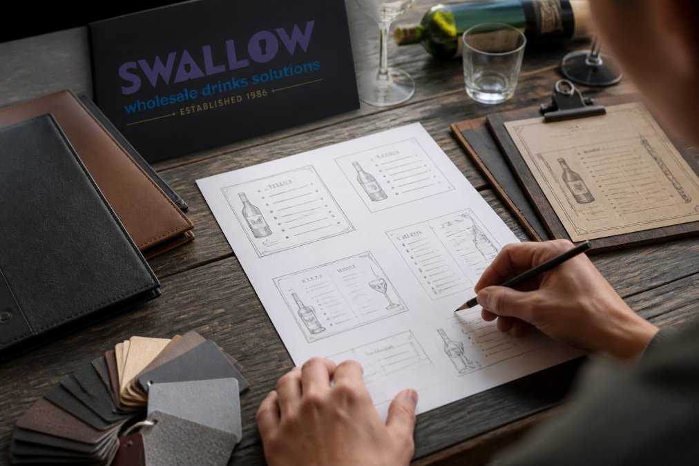
The category-based layout remains the most reliable structure because it mirrors how customers think about drinks. This design organizes offerings into logical groups, spirits, wines, beers, soft drinks, and signature cocktails, making navigation intuitive and reducing decision fatigue.
Start with your broadest categories at the top, then subdivide within each section. Under "Wines," organize by type: whites, reds, rosés, sparkling. Within each subcategory, list items from lightest to most complex, or by price point.
Use consistent typography within each category section. A bold, larger font for category headers creates visual separation, whilst a slightly smaller, regular-weight font for individual items maintains hierarchy. This typographic contrast makes scanning effortless.
Place your profit-margin leaders in the upper-right quadrant of each section. Eye-tracking studies show customers naturally scan left-to-right, top-to-bottom, so items positioned here receive disproportionate attention. If you stock premium proseccos, position these prominently within your sparkling wine section rather than at the bottom.
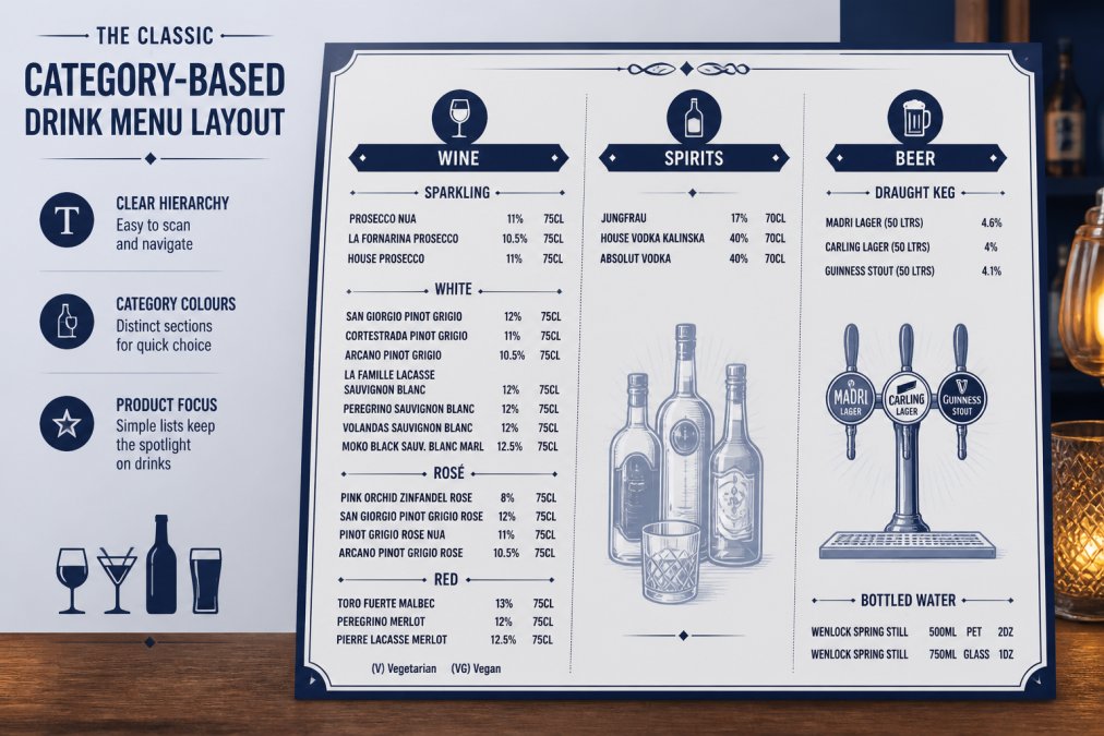
This layout works best for traditional pubs, neighbourhood bars, and gastropubs where customers expect straightforward navigation. It's ideal for venues with broad drink portfolios where customers need clear guidance. The category-based approach feels familiar and professional without requiring customers to learn a unique system.
The minimalist approach strips away visual clutter and emphasizes restraint. Rather than listing dozens of options, this design features a curated selection of 15-25 items, each with careful attention to typography, white space, and visual balance. This works particularly well for venues with a defined brand identity or specific customer demographic.
Minimalist menus rely on generous white space, limited colour palettes, and premium typography. Instead of cramming items into columns, give each drink breathing room. A single-column layout with ample vertical spacing feels more luxurious than a dense multi-column design.
Choose a single, high-quality typeface family, perhaps a clean sans-serif for headers and a complementary serif for body text. Avoid mixing too many fonts. The goal is elegance through simplicity.
Limit your colour palette to two or three complementary colours. Black text on white background with a single accent colour (perhaps deep burgundy or forest green) creates sophistication. This restraint makes each element more impactful.
Minimalist menus work well for premium cocktail bars, wine-focused venues, or gastropubs positioning themselves as upmarket destinations.
Photography transforms a menu from informational to aspirational. High-quality images of signature cocktails, premium wines, or craft beers create emotional engagement and encourage customers to try items they might otherwise overlook. This design combines strong visuals with concise descriptions.
The high-impact visual approach works through contrast: striking photography paired with minimal text. A beautiful image of a cocktail, showing colour, texture, and garnish detail, triggers desire in ways text alone cannot. Pair this with a brief description (two to three lines maximum) explaining the drink's key ingredients or flavour profile.
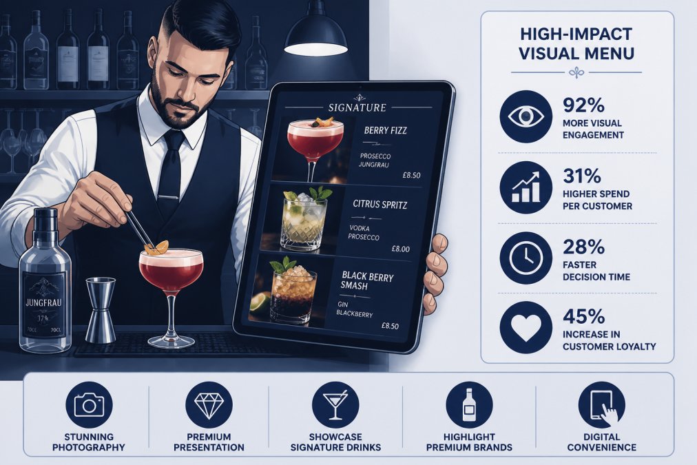
This layout demands high-resolution, professionally shot photography. Blurry phone photos or generic stock images undermine premium positioning. If you're featuring premium wines from suppliers like Swallow Drinks, ensure photography reflects their quality. Consider commissioning professional shots of your signature cocktails or partnering with your supplier for high-quality product photography.
The visual menu works exceptionally well for digital formats, tablets at the bar, QR-code linked menus, or large-format printed menus in upmarket venues.
Regardless of which layout you choose, certain design principles apply universally. These practices ensure your menu is functional, guiding customers toward profitable choices whilst maintaining readability and brand consistency.
Your typeface choice communicates brand personality before customers read a single word. A traditional serif font suggests heritage and formality. A modern sans-serif feels contemporary and clean. A script font can add elegance but becomes unreadable at small sizes.
Choose a primary typeface for headers and a complementary secondary typeface for body text. Limit yourself to two fonts maximum.
Font size matters for accessibility. Body text should be at least 11-12 points for printed menus. Headers can be 16-20 points to create visual hierarchy. Test your menu in actual bar lighting before printing.
Colour influences customer perception and behaviour. Warm colours (reds, oranges, golds) stimulate appetite and create energy, appropriate for casual bars. Cool colours (blues, greens) feel sophisticated, better suited to wine bars and upmarket gastropubs. Neutral backgrounds (white, cream, soft grey) make text and images stand out.
Use colour strategically to guide attention. Highlight your highest-margin items with subtle colour blocks or borders. Avoid neon or highly saturated colours, which cheapen the design.
Colour contrast is essential for readability. Dark text on light backgrounds always outperforms light text on dark backgrounds. Test your colour combinations for accessibility.
White space, the empty area around text and images, is as important as the content itself. Cramped menus feel overwhelming and amateur. Generous white space creates a sense of luxury and makes scanning effortless.
Apply visual hierarchy: the most important information should occupy the most prominent space. Your signature cocktails or highest-margin wines deserve more white space around them than standard offerings.
Line spacing within text blocks affects readability dramatically. Aim for 1.5 times the font size as your line spacing, so 12-point text should have approximately 18 points of space between lines.
Menu engineering applies data-driven analysis to menu design. Rather than guessing which items to highlight, you analyse actual ordering patterns and profitability data to optimise placement and presentation.
The most valuable real estate on your menu occupies the upper-right quadrant, where customers naturally scan first. Position your highest-profit-margin items here. This might be premium wines, signature cocktails with strong margins, or locally-sourced spirits.
Create a "featured" or "recommended" section that highlights 3-5 drinks you want to push. These might be new additions, high-margin items, or products you're trying to move stock on. Staff can verbally recommend from this section, creating multiple touchpoints that drive orders.
Pricing psychology matters. Avoid listing prices in a vertical column aligned to the right, as this makes price comparison too easy and encourages customers to select the cheapest option. Instead, embed prices within the item description or list them inconsistently positioned.
Price your signature cocktails slightly above comparable drinks. Customers perceive items with higher prices as higher quality, particularly in premium venues.
Update your menu seasonally to optimise profitability. Winter menus might emphasise warming spirits and rich wines. Summer menus highlight lighter drinks and refreshing cocktails. This rotation prevents menu fatigue and allows you to feature seasonal products from suppliers like Swallow Drinks, who maintain extensive stock of seasonal offerings.
Track which items sell and which languish. Items that consistently underperform should be removed or repositioned. Items with strong sales but lower margins might benefit from strategic placement to increase volume and overall revenue.
Consider bundling: promote wine pairings with cocktails, or create "flights" of three wines at a discounted rate. These bundles increase average transaction value and encourage customers to try items they might not order individually.
Both formats have advantages, and many successful venues use both simultaneously.
Printed menus feel tangible and premium. They don't require technology, work in any lighting condition, and create a physical touchpoint customers can hold. High-quality printing on substantial paper stock communicates quality. However, printed menus are static; updating them requires reprinting, which is costly and slow.
Digital menus (tablets at tables, QR codes linking to online menus, or large-format screens) offer flexibility. You can update items and prices instantly, test different layouts without reprinting, and gather data on which items customers view most frequently. Digital formats accommodate photography more effectively than print. The downside: technology failures and the impersonal feel some customers dislike.
Many venues successfully combine both. A printed menu provides the core experience, whilst a QR code links to a digital menu with expanded options, cocktail photography, or wine descriptions. This hybrid approach offers flexibility without sacrificing the tactile quality of print.
For venues using digital ordering systems, integrate your menu design principles into the digital interface. The same hierarchy, white space, and typography rules apply.
Creating professional menu designs doesn't require hiring a designer. Numerous resources provide customizable templates and graphic assets specifically for drink menus.
Start with template platforms offering hospitality-specific designs. Many provide editable templates in common software (Adobe InDesign, Microsoft Word, Canva) with professional typography and layout already established.
Stock photography libraries provide high-resolution images of drinks, bar settings, and hospitality environments. Services like Unsplash, Pexels, and Pixabay offer free or affordable images.
Vector graphic resources offer icons, decorative elements, and design assets that enhance menu aesthetics without requiring custom illustration.
When building your menu, consider using your supplier's branding and product photography. Swallow Drinks can provide product imagery and information about premium wines, spirits, and craft beers in your stock. This collaborative approach ensures your menu accurately represents what you're actually serving whilst using professional product photography.
For venues interested in simplifying their ordering and menu management, Swallow Drinks offers trade ordering through their online platform for registered accounts. This integration between your supplier and your menu design process ensures consistency between what's on your menu and what's actually in stock.
A professionally designed drinks menu is an investment in your venue's profitability and brand perception. The layouts covered here, classic category-based, minimalist modern, and high-impact visual, provide proven frameworks you can adapt to your specific venue type and customer base. Combine these layouts with strong typography, thoughtful colour use, and strategic product placement, and you'll create a menu that guides customers toward profitable choices.
The best menu reflects your venue's identity whilst prioritising customer experience and operational efficiency. Whether you choose printed, digital, or hybrid formats, apply consistent design principles and update your menu regularly based on actual sales data. Work with suppliers like Swallow Drinks who understand your market and can provide both the stock and the strategic guidance to build a menu that genuinely works for your business.
A professional drinks menu layout organises drinks into clear categories, spirits, wines, beers, cocktails, non-alcoholic options, with consistent typography and visual hierarchy. Use white space to separate sections, position high-profit items in the visual sweet spot (centre-right), and ensure font sizes are readable from arm's length. Include descriptions for premium or niche selections. Swallow Drinks can help you source the stock that matches your menu strategy, from prosecco and single-serve wines to craft selections.
Menu engineering techniques show that drinks positioned in the upper third and centre-right of a page receive more orders and command higher prices. Use descriptive language and imagery for premium items, separate signature cocktails into their own section, and limit options per category to avoid decision paralysis. Highlight seasonal specials and high-margin drinks with bold typography or subtle design accents. Partner with a reliable supplier like Swallow Drinks, with 40 years' experience, to ensure your curated menu is always in stock.
Effective drink menu design balances visual appeal with readability. Use a consistent colour palette tied to your brand identity, pair complementary fonts for headers and body text, and maintain adequate white space so the menu doesn't feel cluttered. High-quality imagery or vector assets elevate perceived value. Ensure contrast between text and background for accessibility. A clear visual hierarchy guides customers through categories and highlights your best sellers. Swallow Drinks supports your menu strategy by providing a diverse portfolio of premium wines, spirits, and craft drinks.
Menu engineering uses psychology and layout strategy to influence customer choices and increase average transaction value. By positioning high-margin drinks prominently, using descriptive language for premium options, and grouping complementary items together, you naturally guide customers toward more profitable selections. Seasonal rotation allows you to feature seasonal stock and manage stock efficiently. Analyse which drinks generate the most profit, not just volume, and adjust your menu layout accordingly. Working with Swallow Drinks gives you access to a wide range of stock options and expert guidance on sourcing that supports your profit goals.
Members of:


AWRS Registration Number: XJAW00000100730